Macam Mana Nak Cari Jodoh di Malaysia?
900k ahli di sana sedang mengunggu anda di Baitul Jannah. Mungkin.. jodoh awak ada sana.
Daftar Sekarang!
Leopard’s year-old annoyances
- neuroquila
- 15 years ago
- 828
One year ago today, Mac OS X 10.5 (aka Leopard) hit the streets. One of the main sales pitches for Leopard concerned its 300-plus new features, and certainly, there are quite a few winners amongst that bunch. A year later, I can’t imagine using OS X without my always-present always-updated Time Machine backups, easy access to Wikipedia entries in Dictionary, and the oh-so-useful screen sharing.
But perhaps more so than any other OS X release, Leopard brought forth its share of bugs, features missing from the prior version, and features that still make me scratch my head and wonder just what the Apple engineers were thinking.
Less than a week after Leopard shipped, in fact, I wrote about this dichotomy—how this combination of great new features and bugs/omissions in Leopard made it both a “must have” and “must not have” upgrade at the same time. In my line of work, for better or worse, I had no choice, and dove right into the upgrade on all the machines here at Mac OS X Hints HQ.
Now that we’re one year—and five minor updates, with a sixth rumored to be pending—into the Leopard life cycle, I’ve found that Leopard is indeed a feature-rich and powerful operating system. And now, thanks in part to those five minor updates, it’s quite stable. Overall, I’m thrilled with the update, and really can’t imagine going back to OS X 10.4
That doesn’t mean everything is perfect in the land of the Leopard. We’re now one full year into the 10.5 life cycle, but there are still a number of issues that really should have been addressed by now—and yet, they’re still with us, annoying me on a regular basis.
So what are these issues that I keep running into? Some are things that you could do in prior versions of the Mac OS; others are new features in 10.5 that don’t seem to have been very well thought out. Based on that definition, then, here’s my personal Leopard Hall of Shame issues list—presented in reverse order, from least to most annoying.
10. Custom colors in Finder labels: In the dark ages, before OS X saved the platform from oblivion, you could change not only the names of Finder labels, but their associated colors as well. When OS X first came out, you couldn’t even create Finder labels—we didn’t get that capability back until 10.3, more than 30 months after the release of OS X. Now here we are, fully five years past the release of Panther, and we still can’t set our own color choices for Finder labels? I guess OS 9 really was way ahead of its time!
9. The invasion of the blue-gray folder icons: Some users like them, others (including me) hate them. “They,” of course, are the new blue-gray folder icons. In the past, OS X folders have been colorful, and certain key folders (such as System, Movies, Pictures) had nicely customized icons that could be easily distinguished at a glance. Not any more. Now they’re uniformly blue, with certain folders having a slightly darker imprinted icon.
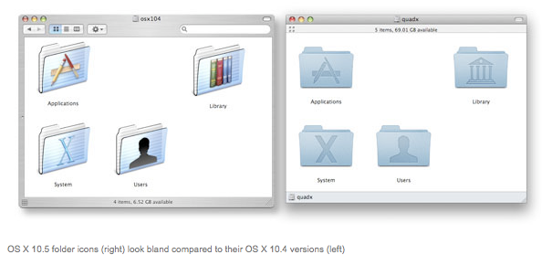
While these don’t necessarily look bad, they’re both boring to look at and (a much worse offense) harder to distinguish from one another at anything much smaller than the 128-by-128 size shown above. I don’t think I’d like to see the 10.4 icons brought back—they do look a bit dated now—but would it have been so hard to use a splash of color here and there to help distinguish key folders from one another?
8. Bluetooth support in Address Book: In OS X 10.4, you could control-click on a contact’s phone number and—if you’d paired your phone with your Mac via Bluetooth—dial the number on your phone, or send that person an SMS. Alas, that's no longer the case in 10.5. Other lost Bluetooth-phone functionality in 10.5's Address Book includes seeing and replying to incoming SMS messages on your Mac’s screen, answering incoming calls, and logging incoming calls to a contact’s info field. These features didn’t matter much to me personally, as I didn’t use or rely on them all that much—and now that I have an iPhone, I wouldn’t be able to use them anyway, as the iPhone can’t pair with the Mac over Bluetooth.
But these features did matter to quite a few others, and yet, Apple doesn’t think they're important features to bring back. The cynic in me would say that’s because the iPhone—as much as I love it—is a Bluetooth-crippled device, as it can only link with a headset and nothing else.
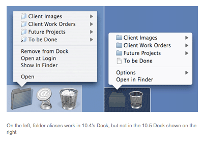
7. Aliases in Docked folders: One of the more-contentious features in the initial release of OS X 10.5 was Stacks, which replaced hierarchical folders on the right side of the Dock. There were lots of issues with Stacks in the initial 10.5 release, and thankfully, Apple addressed nearly all of them in the 10.5.2 update. I say nearly because there’s still one annoying issue: if you have an alias to a folder in another folder that you then place in your Dock, that alias won’t behave properly when you activate the folder from the Dock. That’s a confusing mouthful, so an example may help clarify things.
Let’s say you’ve got your work files spread out over a few different
folder hierarchies, but you’d like to get to them all from one
convenient folder—so you do the logical thing, and drag aliases for
each work folder into your new All My Work folder, and then drop your
All My Work folder onto the right side of the Dock. In OS X 10.4, you
could click the folder in the Dock, and then drill-down into any of the
aliases by just mousing up to each one—a small triangle next to each
let you know that you could drill down into their contents by simply
mousing over each entry.
In OS X 10.5, you can build the same folder, but the aliases don’t work
at all—if you hover over them with the mouse, you won’t see their
contents. As shown above, in fact, a folder alias actually looks like a
document, and there's no disclosure triangle as there is in 10.4. (You
can click one to open the parent folder in the Finder, but that’s not
even close to the same functionality as before.) Doesn't anyone at
Apple use aliases inside folders they keep in their Dock?
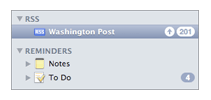
6. Mail’s odd feature creep: For some reason, Apple decided that Mail in OS X 10.5 needed to do more than just handle e-mail—so it gained the ability to create notes, to dos, and read RSS feeds. Are these features users were clamoring for in their e-mail client? Nobody I’ve spoken with—before or after the release of OS X 10.5—has mentioned to me “Gee, I really wish I could create random notes in my e-mail application.” At least notes and RSS reading are completely optional—you don’t need to create notes, and you can delete the included RSS feeds to make the whole section just go away. If you use iCal and To Do items, though, you’re stuck with the space-hogging and totally useless Reminders section in Mail’s sidebar—there’s no option to not see Reminders in Mail.
Why is this? I don’t need to see my reminders in Mail; that’s what iCal (and its automated alarms) are for. I don’t need notes in Mail, I have about three dozen other note taking apps. I won’t even go into the RSS reader, because it’s just too weird to contemplate. It makes me wonder what’s coming in OS X 10.6: Will Chess gain the ability to manage our photo collections? Will I be able to browse the Web in Calculator? Repair permissions in TextEdit? Mail is a very good e-mail client, and it doesn’t need to be bloated with features that have nothing to do with that simple task. If these features must stay, at least give us the ability to easily disable them.
5. The all-covering floating Help Viewer: For reasons known only to Apple—perhaps everyone there works only on dual 30-inch LCDs?—the Help Viewer in OS X 10.5 is a floating window. So when you choose, for instance, Help -> Mac Help in the Finder, the window that opens floats above everything else on your screen.
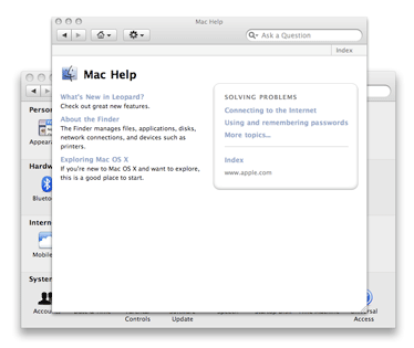
I’m sure the intent here is to make sure you see the help window. Unfortunately, the end result is that (unless you are indeed working on dual 30-inch LCDs) the Help Viewer window will almost certainly block some other window that you really wanted to see—perhaps even a window for the very program you’d like help with! And if you want to leave the Help Viewer open while you go off and do something else, you’ll certainly wind up dragging it around quite a bit so you can see the windows in that other program—as seen in the image at right, when I opened System Preferences with the Mac's general Help Viewer window open.
Not only does the Help Viewer window float above everything else, it turns out that Help Viewer isn’t even a real application—you won’t see it when you press Command-Tab, nor will it show up in the Dock, even though you’re actively using it. Thankfully, there’s a relatively simple fix that restores at least some normalcy to the Help Viewer window—follow the linked instructions, and it will no longer float above everything like the all-powerful Eye of Sauron.
But really, there’s a better answer here: the 10.4 implementation. When you opened help in 10.4, the Help Viewer application showed up in your Dock, and the help window was the normal, non-floating variety. This made it easy to treat the Help Viewer as you would any other application—send it to the background, switch to or from it using Command-Tab, and the presence of the icon in the Dock let you know that it was running. What was so wrong with this solution that led to the all-floating window and invisible application?
4. Time Machine’s limited user-focused features: In general, I love Time Machine. While it hasn’t replaced my other backup methods (a bootable clone of my system drive, and a FireWire drive that we keep off site filled with our data files), it’s amazingly useful, surprisingly non-intrusive, and (excepting the annoying 3-D interface) very easy to use. But it can also be frustrating if you want information about your backups, or want more control over the process. Using its menu bar icon, you can see how much data Time Machine is currently backing up, or the times for the last and next scheduled backups. But that’s about it as far as information goes.
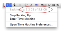
What else might you want to know, you ask? Well, there are times—as seen in the image at right—when it’d be nice to know what Time Machine is backing up. In this case, I knew I hadn’t added 5.8GB of files to my drive in the last hour. And yet Time Machine was busily backing up 5.8GB of something. What it was, though, I couldn’t tell. That’s because it’s basically impossible to see a list of files that Time Machine is backing up (or has backed up). In this case, it turns out that I had moved a video project folder from one spot to another, forcing Time Machine to back it up again.
But I had to figure that out for myself by thinking through changes I’d made in the last hour. That’s why I think it’d be really useful to be able to see, at a glance, which files Time Machine is currently backing up, and which files were backed up the last time it ran. (You can get a little bit more information about Time Machine’s operations by using the techniques covered in this tip, but it’s still nothing close to a file list.)
Speaking of the last time it ran, I’d also love to have more control over Time Machine’s backup interval—it’s hard-coded to run every hour, and there’s no easy way to change that. On my Mac Pro, where I spend most work days, the interval makes sense, as lots of files are changed regularly throughout the day. But when I’m working on my laptop (at home, that is), hourly backups to my AirPort-connected hard drive are overkill—I’m typically just reading mail, surfing the Web, and perhaps working on an article. I’d be more than happy with two-hour intervals for this machine, but no, it too fires off Time Machine every hour, with no way for me to control it (short of setting it off and enabling it when I want a backup done).
3. The Finder’s sidebar: There were a number of changes made to the Finder’s sidebar in 10.5, and to me, most of them were for the worse. First of all, the visibility of the sidebar is tied to the visibility of the toolbar—a completely different piece of the interface! In 10.4, you could double-click on the bar separating the sidebar from the window contents, and the sidebar would vanish. (Double-clicking on the left edge of the window would bring it back.)
In 10.5, there’s now only a one-pixel dividing line, and it can’t be double-clicked. To hide the sidebar, you select View -> Hide Toolbar in the Finder. That’s right; the only way to get rid of the sidebar (which I often don’t want) is to also get rid of the toolbar (which I always want). Even Apple doesn’t seem to know this is how it works, given the incorrect label on that menu option. Pairing these two together is illogical at best—they really don’t have anything to do with each other, and they should be independent, as they were in 10.4.
Beyond that problem, though, the sidebar has other issues. For one, it’s the only area of the Finder that’s completely immune to keyboard control. Using the keyboard, you can control the main menu (Control-F2), the Dock (Control-F3), the toolbar (Control-F5), and even Apple’s menu bar icons (Control-F8). You can’t, however, select or work with the sidebar in any way—you can’t scroll down through the list of devices with the arrow keys, or select a folder by pressing Return. The sidebar basically doesn’t exist as far as the keyboard is concerned.
To me—someone who prefers using the keyboard—this is a moderate annoyance. To someone who lacks the ability to use the mouse, this is a critical oversight. If we’re forced to have the sidebar, it should have the same level of keyboard control as the rest of the Finder.
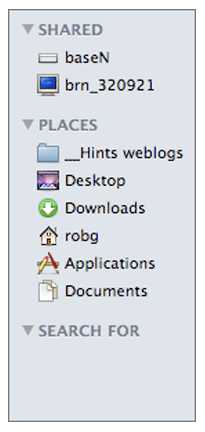
Finally, the sidebar isn’t customizable—well, it gives the appearance of being customizable via the Sidebar tab in the Finder’s Preferences, but that’s mostly an illusion. Sure, you can use that dialog to turn various elements of the sidebar on or off, but that’s all—you can’t, for instance, change the font size or face if you find the default settings too small, too big, or too hard to read. (You can change this for Finder windows themselves, so why not the sidebar, too?) You can’t rearrange the main groups in the sidebar—Devices, Shared, Places, and Searches are locked into that order. Personally, I use Places much more than I use Devices, and I’d rather have it at the top of the list. No luck.
What if you don’t use a section, like Searches? You can disable all the built-in searches in the Sidebar tab of Finder’s preferences, which would get rid of that section, or so you’d think…but no, removing all the entries from a section still leaves it visible. (This is completely different than in Mail, where if you remove all the RSS feeds, the RSS section vanishes.) So you wind up with a strange looking sidebar, as seen in the image at right, showing totally empty sections. If a section is empty, shouldn’t it simply vanish, as it does in Mail? I’d much prefer this behavior, as it would reduce clutter in the sidebar.
2. The ‘new and improved’ iCal event edit/view model: This is one of my two largest annoyances with OS X 10.5, mainly because I rely on iCal to keep me on task and on time for appointments—so I’m in it nearly all the time. In the 10.4 version of iCal, a drawer was used to display the details about whatever event or to do you had selected in the calendar.
This made it super easy to flip through your schedule and see what was coming up—just select an event in the main calendar, then use the Tab key (or Shift-Tab) to move back and forth as needed. As you moved from event to event, the drawer’s contents would update to show you the selected event’s information.
Thanks to the drawer, you could have a compact calendar view when you wanted it—just use the Hide Drawer menu option, and it slid neatly out of view. But I typically left it open all the time, as I loved being able to just glance at the screen to see an event’s details. You could even detach the drawer if you wanted to, turning it into a small floating window.
If you wanted to edit an event’s details, you would just select the field(s) you wanted to change, and change them—there was no real difference between browsing an event and editing that event. I found this interface to be intuitive, fast, and very flexible—you could see (or not see) event info in an attached (or floating) window, based on your personal preferences.
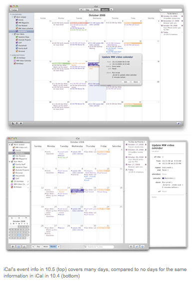
In 10.5, all that goodness is gone. The drawer is gone, banished to the Land of Deleted Features. Instead, event information is always hidden, unless you specifically call it up by pressing Command-I (or choose File -> Get Info).
When the event info window appears, it then blocks out the calendar behind it—and if you mainly use month view, as I do, that means that there are several entire days that aren’t visible—and one of those blocked days might contain, for instance, a meeting or to do that you wanted to see while viewing the current event.
The image above shows iCal in both 10.5 (top) and 10.4 (bottom); notice how many days are covered in the top image, versus none in the bottom.
Even worse than the blocked background, though, are the keyboard gymnastics required to use this new method when browsing multiple events. I select an event and press Command-I to see its info. If I want to then see the info for another event, I must first close the info window (Command-I again), otherwise my key presses will be sent to the info window. So browsing multiple events becomes: Tab - Command-I - (read event info) - Command-I - Tab - Command-I - (read event info), etc. Tell me how this is progress over simply pressing Tab and moving my eyes from one section of the screen to another?
Things get worse if you want to modify the event information—you have to actively enter Edit mode now, which requires clicking the Edit button in the info window. After editing your data, you click Done, expecting (perhaps) to return to the info window, which is where you were when you entered edit mode. Instead, the info window closes entirely, leaving you back at the calendar view. So to verify that you made the correct changes, you have to press Command-I again, just to bring up the info window you’d already opened once!
For those who prefer the pop-ups (though I’ve yet to meet anyone who does) I have a recommended solution for Apple. Leave all the existing features as they are in iCal, but just add back the drawer, and a user-accessible preference to enable it. Those who like the new iCal interface—speak up, anyone?—will continue as they are, and those of us who find the new interface convoluted and poorly thought out can switch back to the drawer version with the toggle of a single preference value. For the sake of my sanity and my fingers, please rethink this ‘improved’ iCal interface—it’s a large step backwards from the usability of prior versions.
1. Spotlight results in the Finder cannot show additional columns: My top 10.5 annoyance has to do with Spotlight—which is somewhat surprising, as the improvements in Spotlight in 10.5 have made the search feature incredibly useful. Being able to search on phrases, use boolean logic, and easily search for filenames in the Finder are just three of many improvements that turned me from a Spotlight hater into a Spotlight advocate. But, unfortunately, one glaring omission in Spotlight—or perhaps it’s in the Finder—means that some of the most-useful ways that I use Spotlight no longer work well in 10.5.
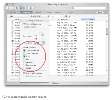
In OS X 10.4, when you ran a Spotlight search in the Finder, you could switch the results window into list view, and then customize exactly which Finder columns would be displayed. As an example, one of my often-used Spotlight searches is for files greater than 100MB in size—this helps me quickly find large game demos I may have downloaded and never deleted, for instance.
In 10.4, I could run that search, then switch to list view, open the View Options dialog box, and (as seen in the top image of the image at right) choose which columns I wanted to display, including Size. It was then trivial to sort on the Size column—just click the Size column heading—and all my super-large files would float immediately to the top of the list.
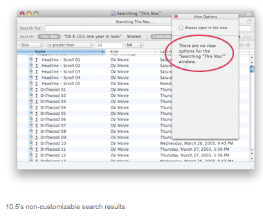
Try that same search in 10.5, though, and the results are basically meaningless. That’s because the Spotlight search results window in 10.5 only displays three columns: Name, Kind, and Last Opened. So after running my search for files over 100MB in size, I have a list of matches…with no simple way to see—much less sort—the list by size! So while I know that file XYZ is over 100MB in size, I don’t know just how large it is.
As you can see in the image at right, you cannot customize the displayed columns at all, so there’s no way to see the size in the results list. The only semi-solution I’m aware of is to open the Inspector window (Command-Option-I), and then move through each file one by one with the arrow key—as you do, the Insepctor will show that file’s information. This is so far from usable for large searches, though, that it’s not much of a workaround.
This becomes even more annoying if you want to use any of Spotlight’s other search fields to do more advanced searches. You can, for instance, run a search on exposure time for your images—find all images with exposure over one second. Again, though, you can’t modify the search results to see the actual exposure time, so you’re back to using the Inspector window. It’s wonderful that we can search on all these fields, but the usefulness of the feature drops to near zero if we can’t actually see the values we were searching on. (To be fair, 10.4 couldn’t display these additional fields either; but at least it could handle the standard Finder columns.) I reported this as a bug early on in the Leopard life cycle, and it was quickly marked as a duplicate. Unfortunately, that’s the only activity I’ve seen on this issue in the last year.
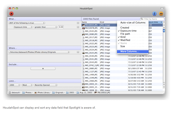
My solution to this problem has been to switch to HoudahSpot for my advanced Spotlight searches. Not only does it let me build my search criteria first (without searching as I type), but it can display pretty much any Spotlight field as a column in its results list:
So thanks to the limitations in 10.5’s Spotlight search results, I’ve found it best to stick to the Finder for simple searches, and let HoudahSpot do the heavy lifting. I would think that making Spotlight work properly in the Finder (or work at least as well as it did in 10.4) would be high on the list of priorities, but that hasn’t been the case during Leopard’s first year.
What lies aheadDespite this list, though, I’m still a Leopard fan, and really enjoy many of the new features it brought to the table. Given that Snow Leopard has now been announced with a ship date of “about a year” from the June 2008 Developer’s Conference, I guess I can only hope that many of the items on my list are addressed for its release—I’m not holding my breath to see any of them fixed in the any 10.5 minor updates between now and then.
I’m sure my list differs from yours, and if you’ve got a particular Leopard issue that’s bugging you, I’d love to read about it in the comments.
Article courtesy of Macworld